Dynamic range compression: an explanation
inspired by BadBadNotGood
I recently discovered the BadBadNotGood album BBNG2. It inspired me to take a look at the dynamic range compression being used on the album, which prompted me to write an explanation for my friend who introduced me to it. To illustrate the effects of dynamic range compression on a piece of music, I put together a comparison of the dynamic range of four different songs, two by BadBadNotGood and two by another contemporary jazz-influenced genre-defying group called Portico Quartet. The waveforms you see below illustrate the peaks and valleys of the sound at any given point in time, so when the grey area is tallest, that will be heard as the loudest or fullest moment in the music. Normally, build-ups are easily visible in the waveform because you can see the waveform getting taller. Those differences can be difficult to see, however, when a lot of dynamic range compression and normalization is applied to the music. What that means is that the difference between the loudest and quietest parts of the music is reduced by making the louder parts quieter and the quieter parts louder (the compression), and then the volume of the entire piece of music is increased as much as possible while still avoiding distortion (the normalization).
There is a tendency in contemporary audio recording and mixing to use a lot of dynamic range compression in order to make sure that the whole song is loud enough to hold people’s attention and be audible “over the noise” (like when listening to the radio in a public setting). It is based on the assumption that quiet moments in a song will lose the listener, particularly when other popular songs on the radio (or playlist) will be loud throughout their duration. This has created a kind of dynamic range arms race where producers have to make sure they amp up the total volume of tracks as much as possible.
As a result of this trend, a lot of contemporary music will give the impression of a build-up without it being very visible in the waveform. This is accomplished through song writing, lyrical inflection (the singer or saxophonist or guitarist or whoever getting clearly passionate or intense in their playing), more notes or drum hits, an accelerando, building to a fuller (though not louder) sound, etc., and some of that seems to be at play in BadBadNotGood’s “Flashing Lights”. To see what that looks like, here are waveforms of a few tracks for comparison:
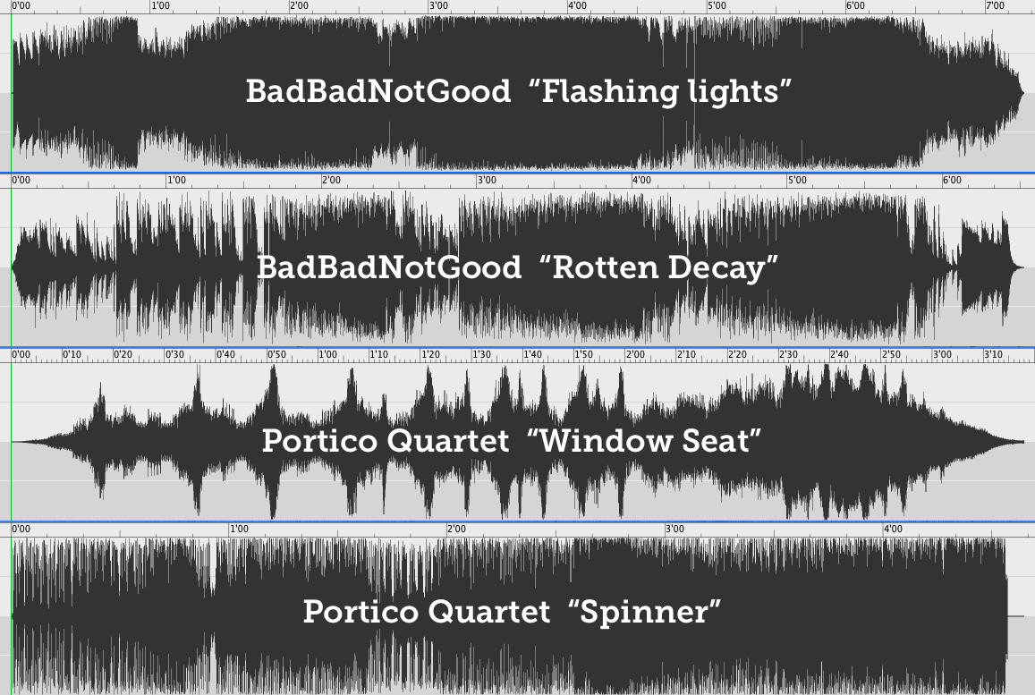
As you can see, the most highly compressed and normalized track is “Flashing Lights”, more so even than BadBadNotGood’s other tracks, such as “Rotten Decay”. Portico Quartet’s “Window Seat” is radically different with lots of visible crescendos and decrescendos and a very wide dynamic range. The bottom track, “Spinner” is more of a fair comparison, because it also has some of the noisy distorted droniness of the BBNG track. But if you follow just the middle solid section (and more or less ignore the periodic spikes, which are the result of regular, loud percussive hits), you can still see a lot more dynamic variation.
Interestingly, however, the use of dynamic range compression in “Flashing Lights” has a noisy chaotic effect on the feel of the track that I think is actually quite effective, and not an indication of marketing concerns overtaking artistic concerns (particularly when you consider that BBNG’s music is entirely non-commercial, and that it seems to be impossible to give the band any of your money).
If you are curious to know more…
Wikipedia has a good explanation, and this animated GIF from the Wikipedia article offers a particularly striking demonstration by comparing the waveforms of remastered versions of the same Beatles song (“Something” from Abbey Road) over the past few decades.