Readable light text on dark backgrounds: a case study
optimizing type for Chrome and Safari
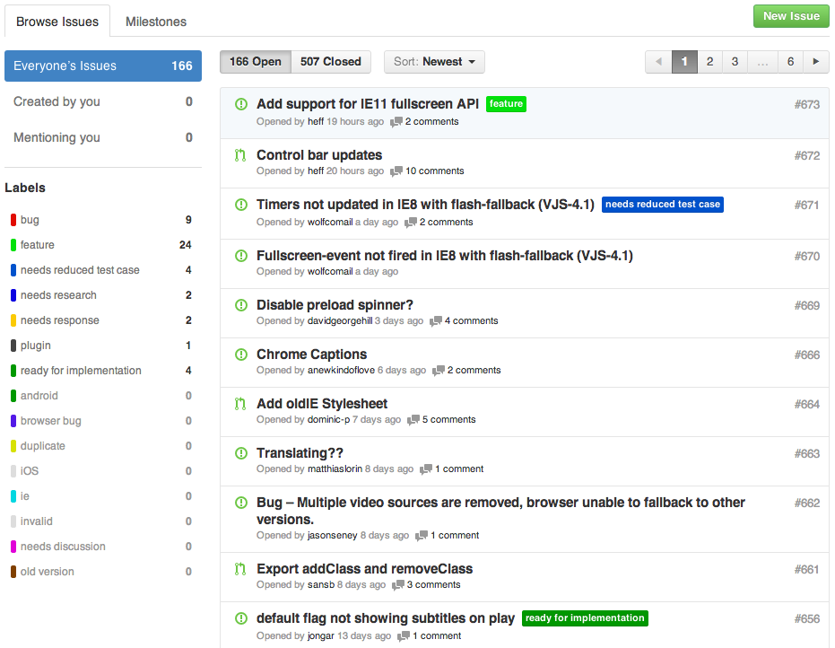
While browsing the Issues page for VideoJS on GitHub today, I was having trouble reading the text of the inline labels that appear next to the titles of some issues. These labels have white text on colourful backgrounds, and in Chrome and Safari, that white text looked blurred with poorly defined edges that bled into each other, because they are being rendered with subpixel antialiasing. A very easy fix is to specify -webkit-font-smoothing: antialiased; for all text that will be display as light on black.
I applied that CSS to the Issues page and took before and after screenshots (in Chrome v30). Toggle the “Apply -webkit-font-smoothing: antialiased” control to see how it is rendered with and without subpixel antialiasing.
![]()

John Gruber linked to a UsabilityPost piece a while back that asks web developers to stop using and abusing -webkit-font-smoothing: antialiased;
And in the piece Gruber linked to, Dmitry Fadeyev observes that dark text on light backgrounds benefits significantly from the default subpixel-antialiased rendering of Chrome and Safari:
The sharpness of subpixel rendered text makes long portions of body text more readable. Light text on dark background, at least on OS X, is the opposite. Subpixel text tends to spill out and make the font appear bold. Here, the antialiasing mode actually becomes useful in helping refine the lines.
Daring Fireball is a good example of that second use case.
A final note: the distinction between renderings becomes pretty much moot on high-density (retina) displays. Both subpixel-antialiased and antialiased are crisp and highly legible. But if you’re building a website today and you’ve decided you no longer care about the UX for readers with non-retina displays, I entreat you to reconsider.